

Poster Art
Movie poster art is marketing, but it’s also a tone-setter and a plot descriptor. It shows you the people in the movie and prepares you for what you are about to see. A lot of times nowadays, people talk about the “floating head” designs, in which the poster sticks the big faces of the cast in a collage over some vaguely identifiable content that is featured in the movie, i.e. superhero movie posters. Sometimes it’s done well, sometimes it is not.
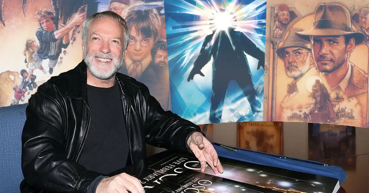
Posters in modern cinema are, by and large, made by photoshopping images together to various quality, but there was an era decades ago where artists would paint movie posters and the piece of marketing would truly become a work of art. There is a bevy of artists who have created some of the most famous poster designs in film, but one of them who is most notable (known mostly for his 80s blockbusters) is the late, great Drew Struzan. His distinct style is iconic — drawn, vibrant, bold. They’re almost a bridge from classic era movie posters to the posters we see now. His drawings tend to give the movie some elevated class.
Today, we take a look at a few of our favorite pieces by Mr. Struzan.
5. Hook
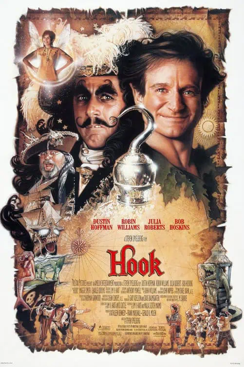
You just look at this and want to smile. Here, Struzan makes use of the pirate motif by framing everything in a treasure map. You have your two main focuses — Robin Williams and Dustin Hoffman — back-to-back as adversaries, but also as the dual star-power of the film, then in between them, the titular and iconic hook. I swear, he even put some extra shimmer in Williams’ eyes to make him look more innocent and magical. It’s a busy poster, but amazingly never feels too cluttered. The poster just screams adventure and fairy tale.
4. Coming to America
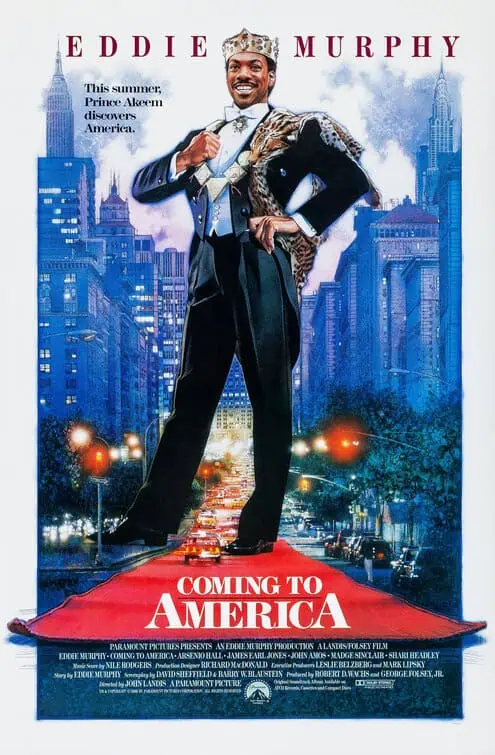
I feel like this one doesn’t make everyone else’s top of the list, but for me, it’s such a dynamic image. Funnily, Struzan originally created the New York City background for Crocodile Dundee II, but the studio opted for something different. So, he was able to use it for Coming to America. You have Eddie Murphy standing with great stature in what feels like the same naive, oblivious nature that he has in the movie, which just makes me laugh. You just have to love Prince Akeem’s happy demeanor. The red carpet is rolled out for him, he sticks out as the fish-out-of-water figure that he is.
3. Star Wars: Episode I – The Phantom Menace
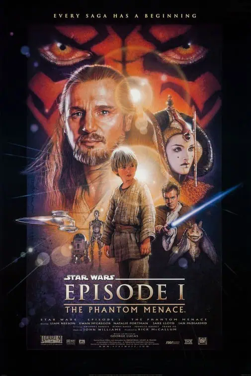
Regardless of how you feel about the movie, this poster will always get you so hyped. It was the bridge from the classic era to the modern era. It may have influenced the “floating heads” and the “collage” compositions of today. Just previously to this, Struzan created new art for the Star Wars Trilogy: Special Edition that became iconic in their own right and this poster just showed us that Star Wars was back. The glare of Tatooine’s twin suns was like a shine of hope and Darth Maul’s menacing eyes taking up the top was both badass and intimidating. Liam Neeson’s Qui-Gon has a look of nobility, while Anakin Skywalker is centered, foreshadowing his importance. The poster was one of the big factors that the hype this movie had became the hype that it was.
2. Indiana Jones and the Temple of Doom
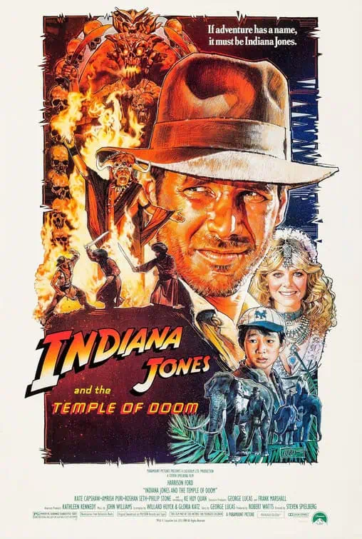
If The Phantom Menace was a bridge from a classic era to the modern era, Struzan’s poster for Indiana Jones and the Temple of Doom is a bridge from the golden era to the classic era. It is such an 80s poster, but it also throws back to the adventure serials of Steven Spielberg and George Lucas’ youth, which is what their aim with this franchise was. The composition is different, with the main focus of our heroes slightly pushed to the side and given a nice, friendly color tone, while the temple stuff on the opposite side burns in a fiery red and orange color scheme that intimidates you. It gives you a good idea of the polarizing, darker tone of the movie.
1. Back to the Future
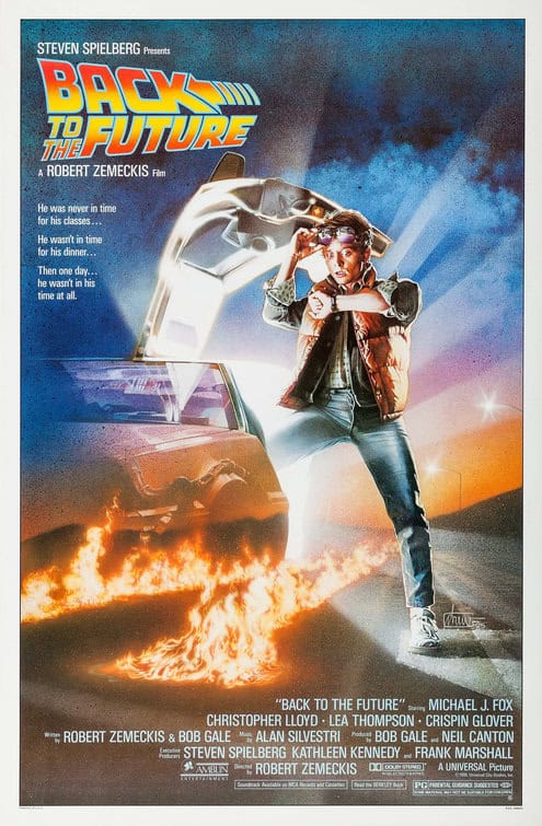
It just feels like there is no poster that is as iconic as the one from Back to the Future. It’s a simpler image — no collage, no floating heads (although Struzan had gone through several drafts of those). It’s an image that is so dynamic that the title of the movie is even pushed to the side. The poster is full of mystery, but it has a very schlocky sci-fi feel with Marty McFly emerging from the Delorean like an alien from a spaceship (which goes nicely with the gags in the movie). The panicked look on Michael J. Fox’s face has the perfect comedic tone of someone being displaced. The Delorean fades away into the sunrise (which is why I used to think it was red for some reason). That showcases its extraordinary nature and plays into the time-erasing threat later in the movie. And finally, you have the iconic fire trails at the bottom. You look at this image and you feel as though you are watching the movie.












The comment section exists to allow readers to discuss the article constructively and respectfully, focused on the topic at hand.
What’s Not Allowed